This full-colour option is to be used in it complete and full-colour form whenever possible, in both print and above-the-line media, and in all other usages not requiring a simplified format.

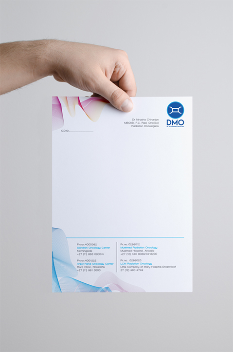
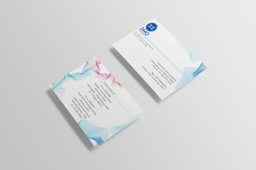

Oncology can often be a daunting subject for the average person, most people are intimidated by complex medical terms, which are difficult to grasp.
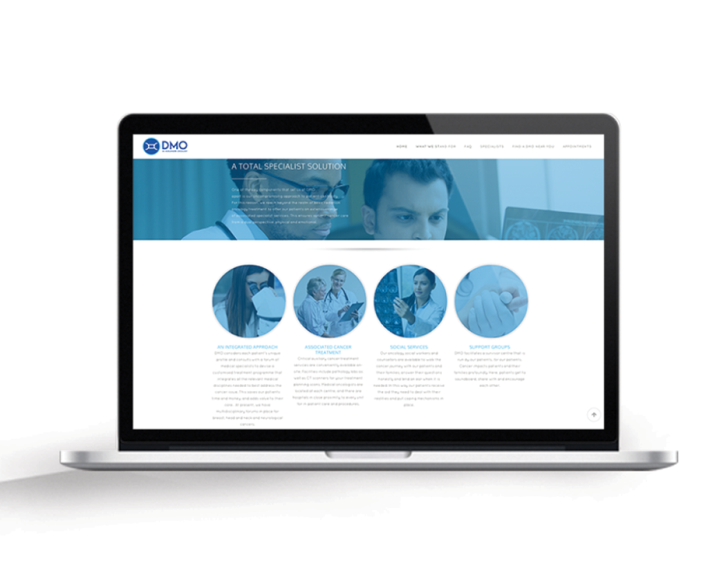
The majority of people, who seek services from an oncology center , doing so during an emotionally charged period of their lives. The last thing they need is a confusing experience when they are trying to get answers.
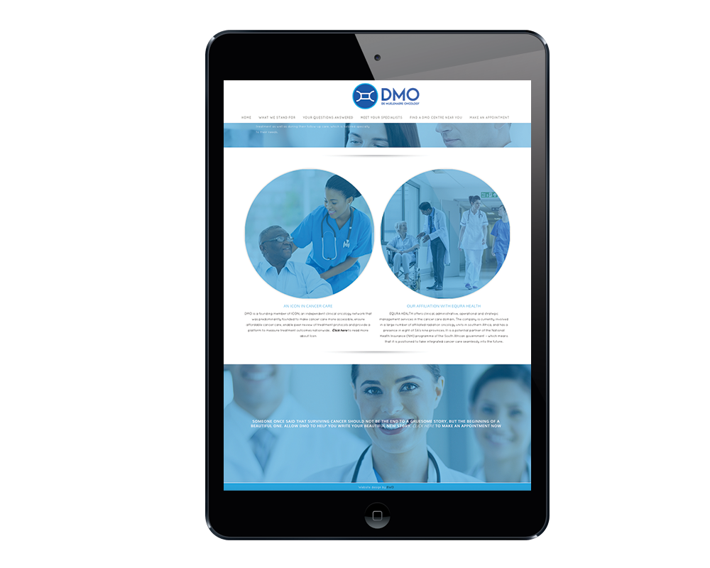
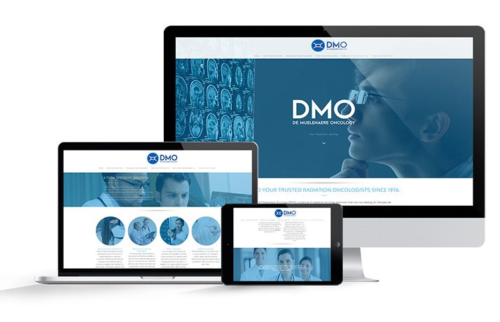
Inspired by the field of radiology, we sought to create a site populated by imagery, which is designed to reflect the blue hues associated with X-ray sheets, whilst simultaneously contributing blue’s psychologically calming effect.
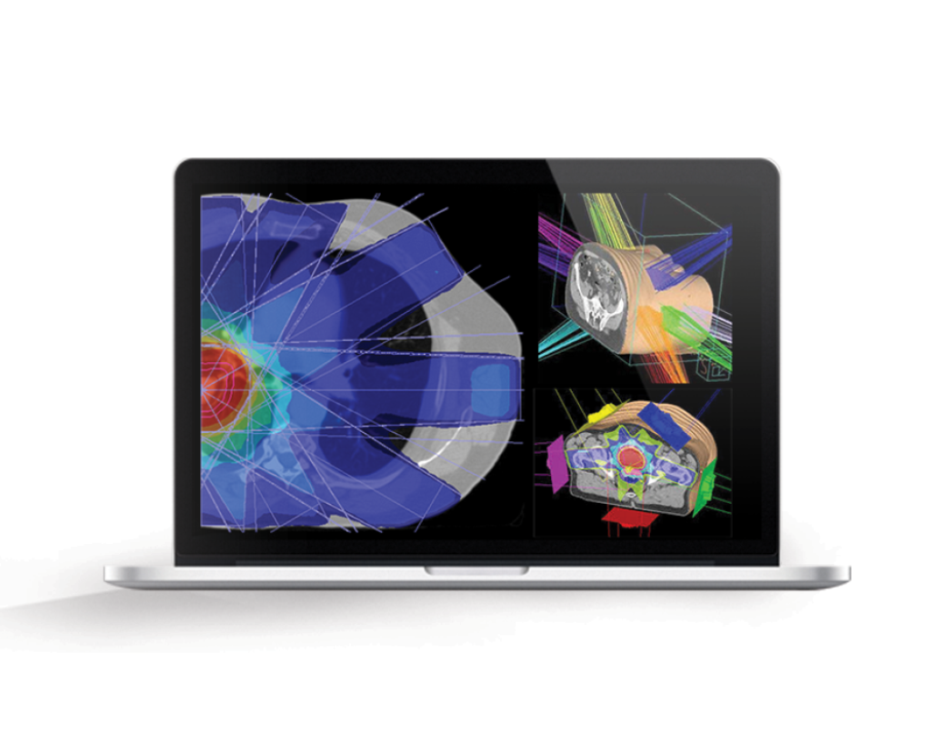
We created a simple and intuitive layout aligned to imagery, which reinforces the circular shape introduced in the logo. We focused on making the user experience as simple as possible by compartmentalizing the content under clearly marked sections and reducing the character in the navigation to the bare minimum needed to convey the message, which results in a more uniformed header across multiple screen sizes and a more intuitive user experience.
