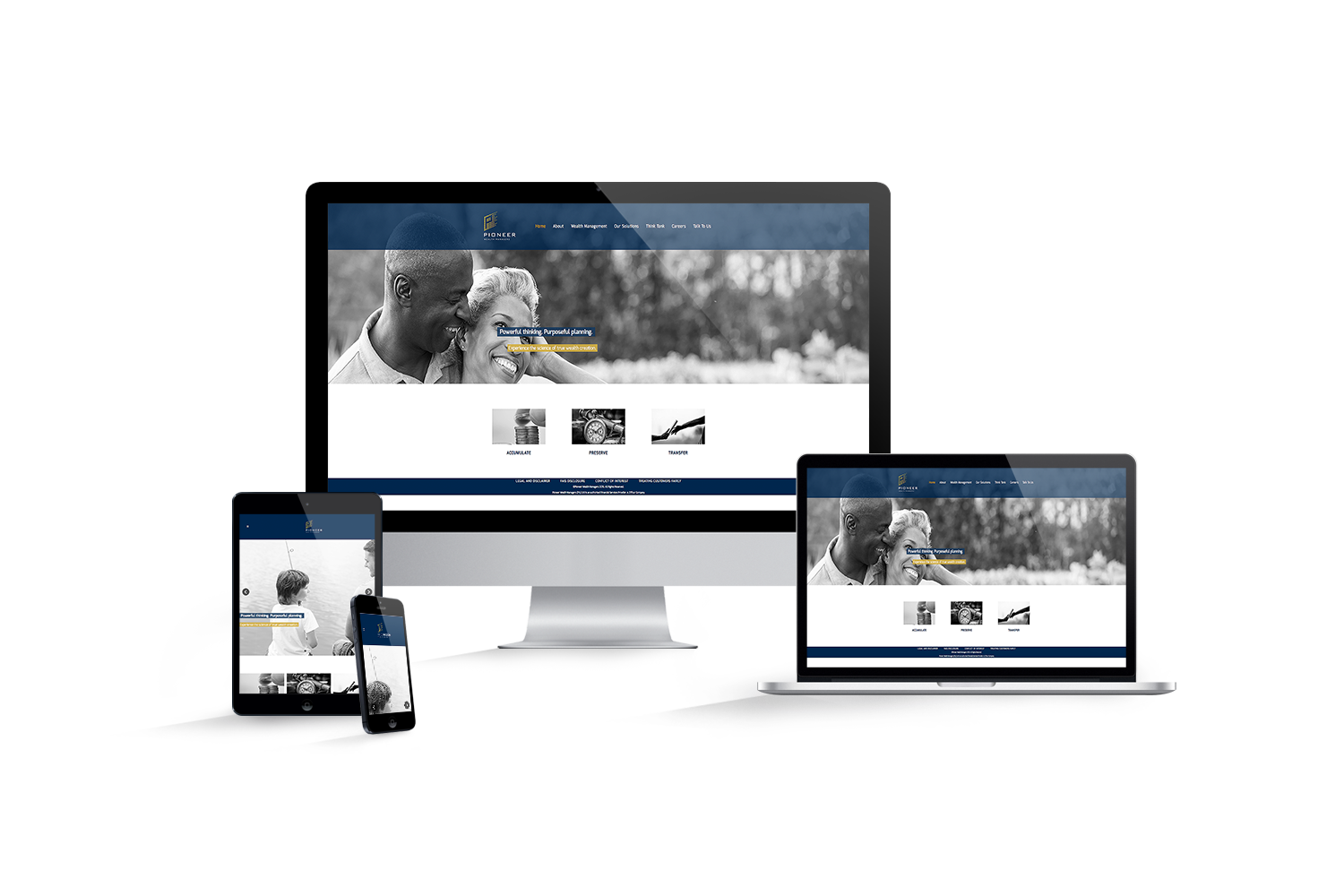
The Newly created Pioneer Website is Designed as a meaningful look into the Pioneer company and what they offer. We had to first analyze the information provided and then do research on different competitors and their styles, we then devised a plan to makePioneer stand out.The Prominence of the dark blue color had to be contrasted by the use of beautiful black and white imagery, which also added to the overall effect we were trying to portray. We wanted the viewer to not just view the website, but Feel it. Slow transitions and minimal animations along with a simplistic feel and the use of negative space added emotion to the site. The viewer is taken on a journey through Pioneer Wealth Managers and at the same time being well informed without being overwhelmed by too much information. The use of gold accents in every page, add an eloquent feeling of elegance. The overall style is professional and clear. “Simple” means easy, easy for the viewer to understand. Good visuals along with relevant information mixed with the element of design are what sets this website apart from the rest.
Ready to Talk ?
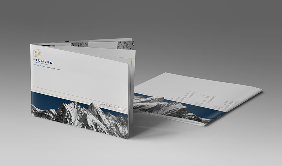
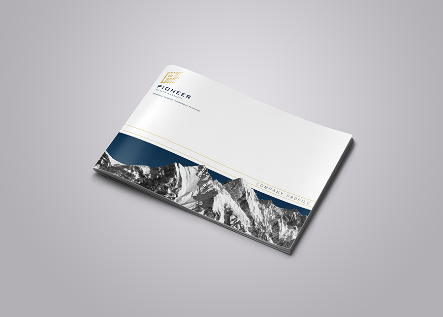
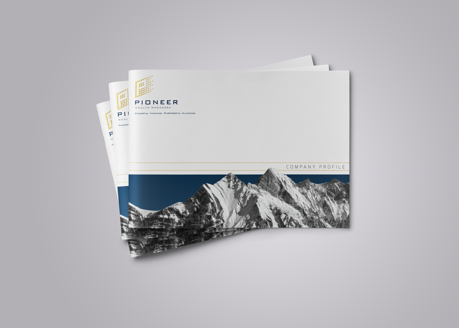
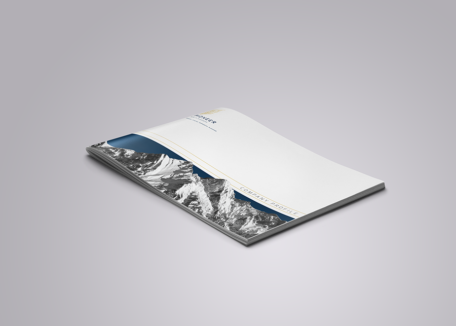
Front Cover
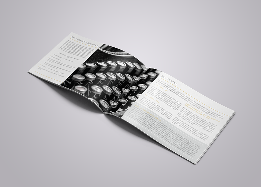
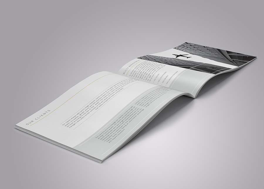
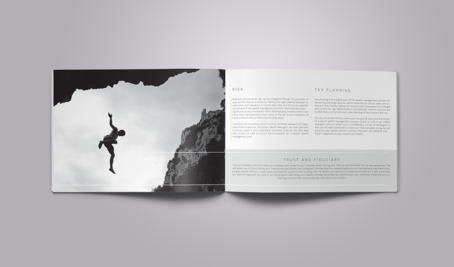
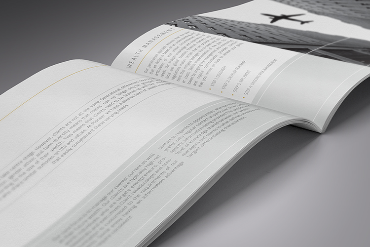
Inner Pages
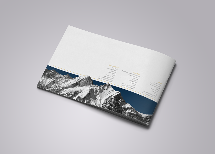
Back Cover
