21 Apr Does Your Company Profile Need An Update?
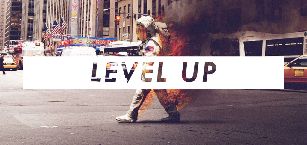
Your company profile is often the first interaction people have with your business and what it has to offer, kinda’ like a tinder profile for your business. But if yours looks like it predates the Clinton administration, It might be time to level up.
01. Negative Space
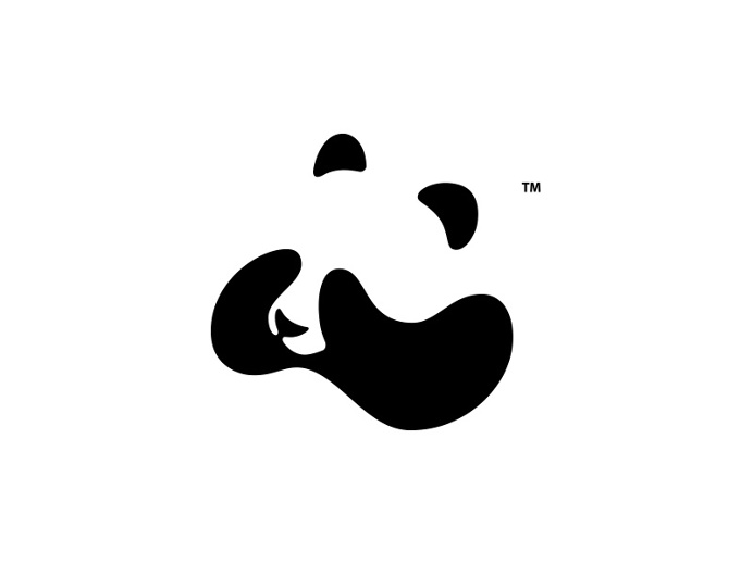
“But can’t we squeeze something in there?” If you’ve ever caught yourself uttering this phrase, then this, my friend… is for you. Negative space is a fundamental part of any good design. Negative space loves you, it’s not an evil boogeyman lurking in the shadows and plotting to make your layout “look empty”. But when used properly, negative space can be a great way to introduce balance and breathing space to your design and create a deeper meaning to your designs by playing off of the relationship between negative and positive spaces.
02. Dramatic Typography
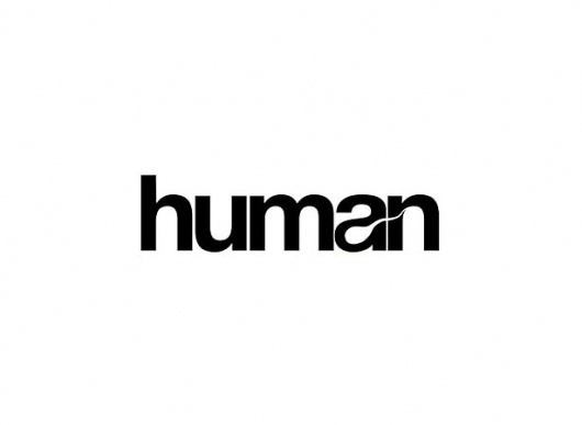
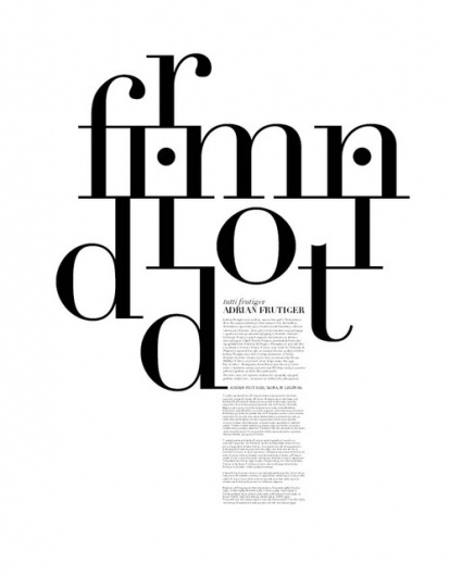
“ Can We make it 18 point Arial…Bold!?” Believe or not there is a galaxy of fonts out there beyond Old Faithful- Arial, Bold, and inviting some new fonts to the party can be a simple yet surprisingly effective way of modernising and drastically improving any design.
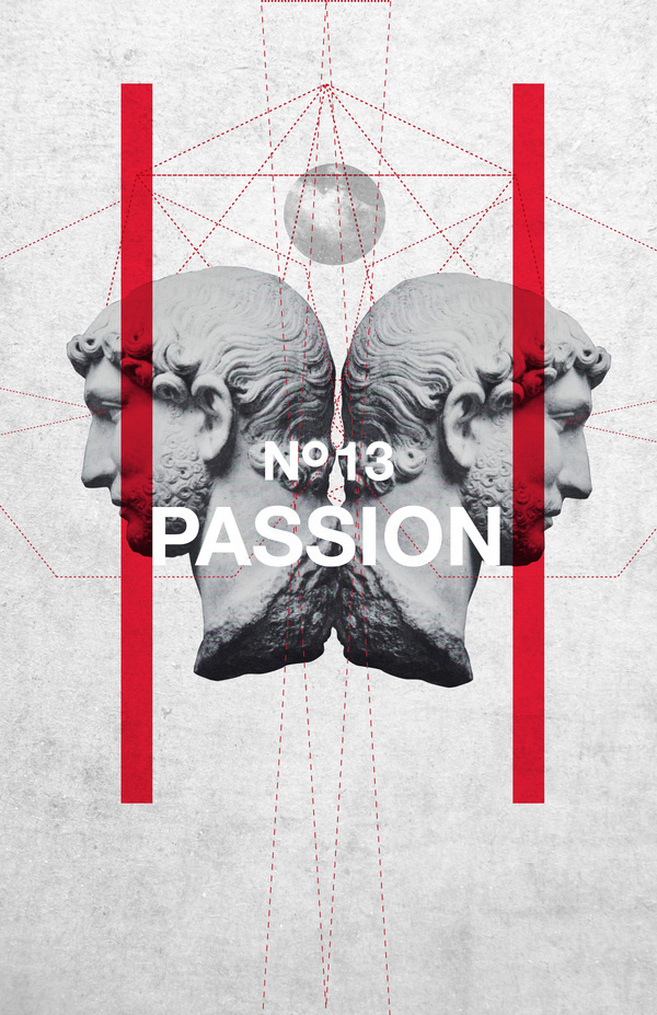
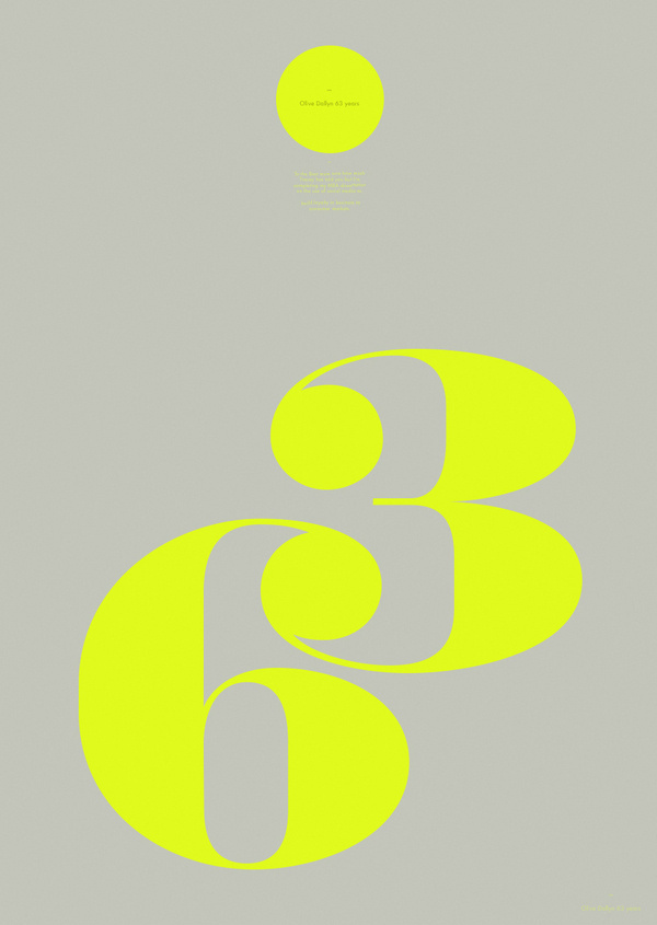
Typography needn’t merely be a vehicle for communicating your copy—it’s for making brash and bold statements. Experimenting with big, bold typefaces that grab the attention and engage the viewer. You can create a sense of drama through size and spacing or via unique textures colours, and arrangements.
03. Abstraction
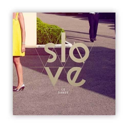
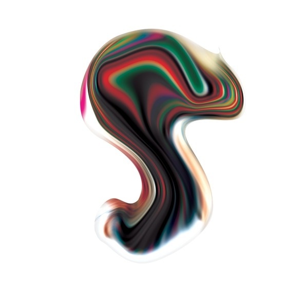
“But that what does that have to do with me?” If everything was spelt out for you and presented on a silver plate, life would be rather dull don’t you think? Great design needs to communicate- yes- but it should also engage, challenge the viewer, offer a different perspective, be radical…say something! So berating people with visuals of suit-clad stock brokers for your investment company profile won’t be an insult to their sensibilities, but it won’t make them sit up and take notice either. Incorporating some abstraction in your design can be a great tool for engaging with the audience, and inviting them to ponder about the concept of the deign rather than being badgered with the same old thing that they’ve seen a million times over.
04. Bright, Bold Colours
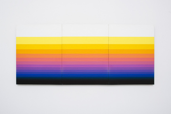
“Isn’t that green a little too green?” They say fortune favours the brave, well that holds true for design as well. One of the most psychologically effective tools in the design arsenal is colour, yep that little six digit Hex code can be the difference between a hit and a miss. Move away from those drab and muted, 1960s-inspired colour palettes in favour of bright pastels, luminous neons, and richer, more saturated colours. If your goal is to introduce your designs to the 21st century, a vibrant new colour scheme might just be the thing that that old profile has been begging for, besides all you need to do look is check out Pantone’s Spring 2016 Color Report to realize that, that old “safe” corporate blue is well past its sell-by date.
05. Modularity.
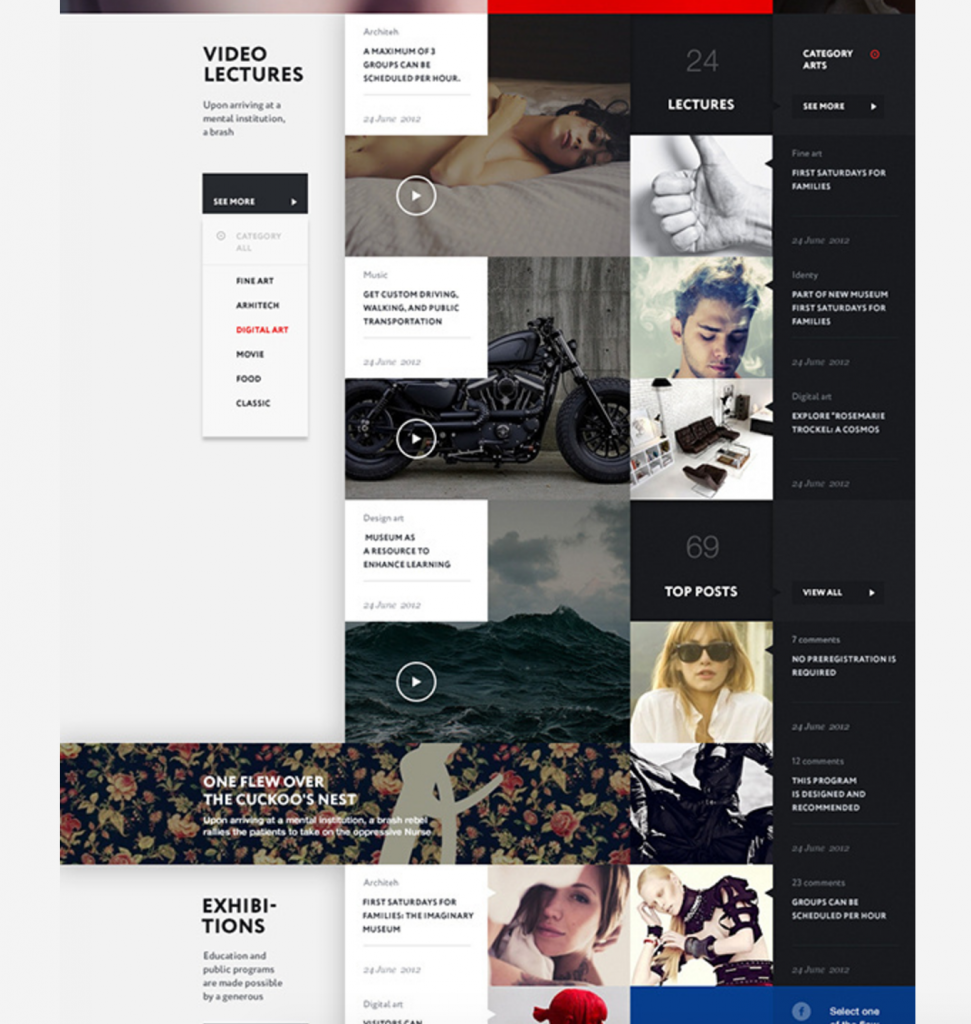
“Will this be enough content? I can add more” Modular layout design style does an exceptional job at breaking up long reams text and organising it into manageable chunks of copy that’s easier to digest and less intimidating than a layout that resembles an economics textbook. Instead of long-form blocks of text. making the information more manageable entices more people to want to interact with it. Modular design functions as a fantastic management tool while also it also looking really professional and being a welcome breath of fresh air.
