20 Oct BWD 2018 Website Design Portfolio
We’ve put together a list of some of the best websites that we’ve created in the past 12 months. Simplicity is the ultimate sophistication. We always aim for minimalistic design style unless of course, the client brief says otherwise. Our portfolio covers different industries from construction, law firms, tourism, etc. This shows our versatility when it comes to website design. A similar list for our business profile layout designs can be accessed here.
Engineering & Construction
Mekan Group: Rationale
The website layout encompasses a mechanical and modern design that proves eccentric and savvy animations by use of geometric shapes, the bold use of the corporate colours and the use of a value proposition that communicates the problem Mekan aims to solve. The images that are used give the viewer a visual presentation of what the company is about in the construction industry and represents the raw and authenticness of the services that the Mekan Group provides.
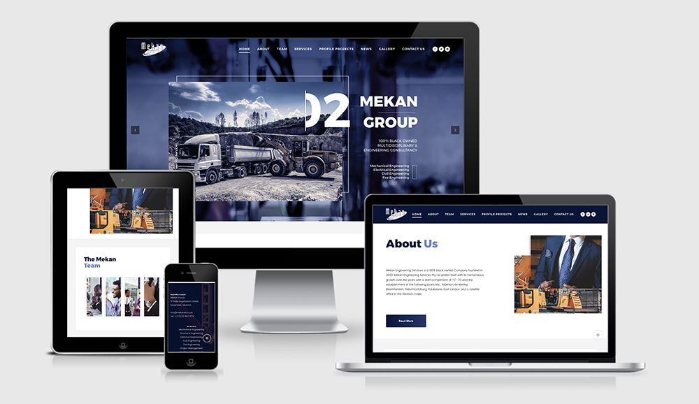
Company Name: Mekan Group
Tema Civil: Rationale
In this layout, the main element we used is the triangle as it represents structural strength. The triangle is the most rigid frame structure taken from the pyramid reference where sections of its structure contain a strong foundation from the bottom upwards. We demonstrate the use of squares or cubes shapes as a clever interpretation of mathematics whereby this reference comes into play when one square is divided to create two triangles. We position Tema Civil as the smart and strategic construction company through the design concept explained above.
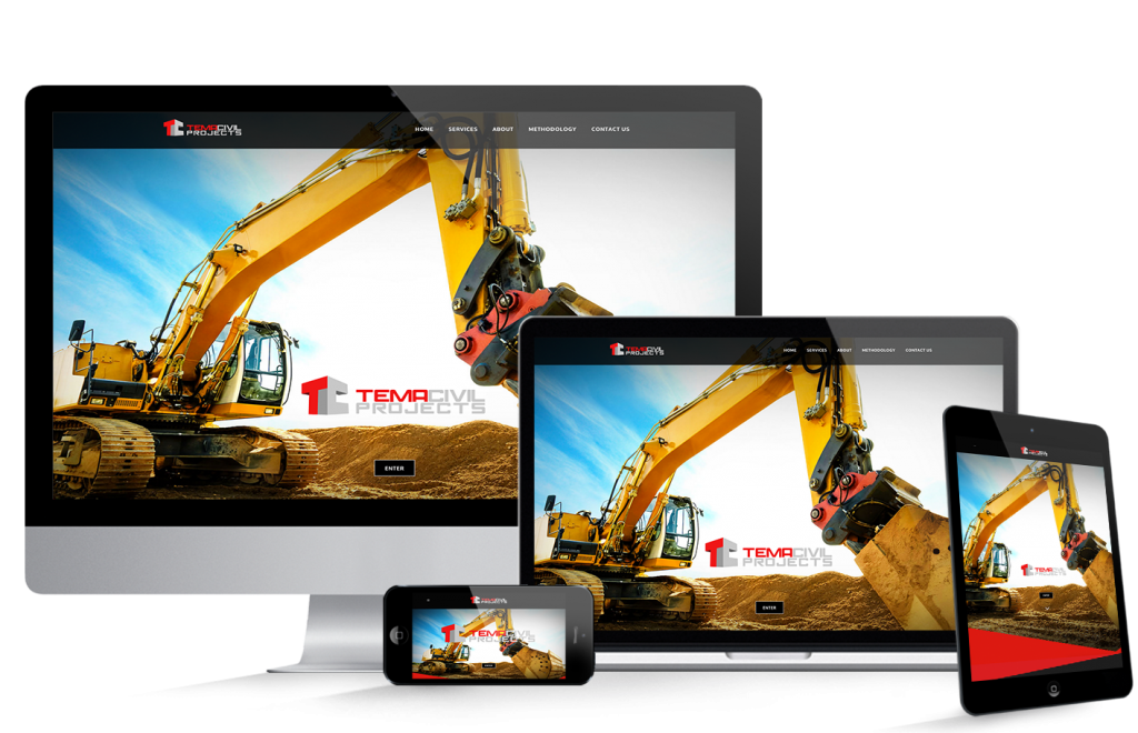
Company Name: Tema Civil
Law Firms
TGR Attorneys: Rationale
On the TGR Attorneys website, the design takes a reference to the corporate industry to allude to the serious nature of the industry by the use of black and white imagery throughout the website. In the website design and layout white space matters most, and the simplicity of minimal use of corporate colours, shapes and line.
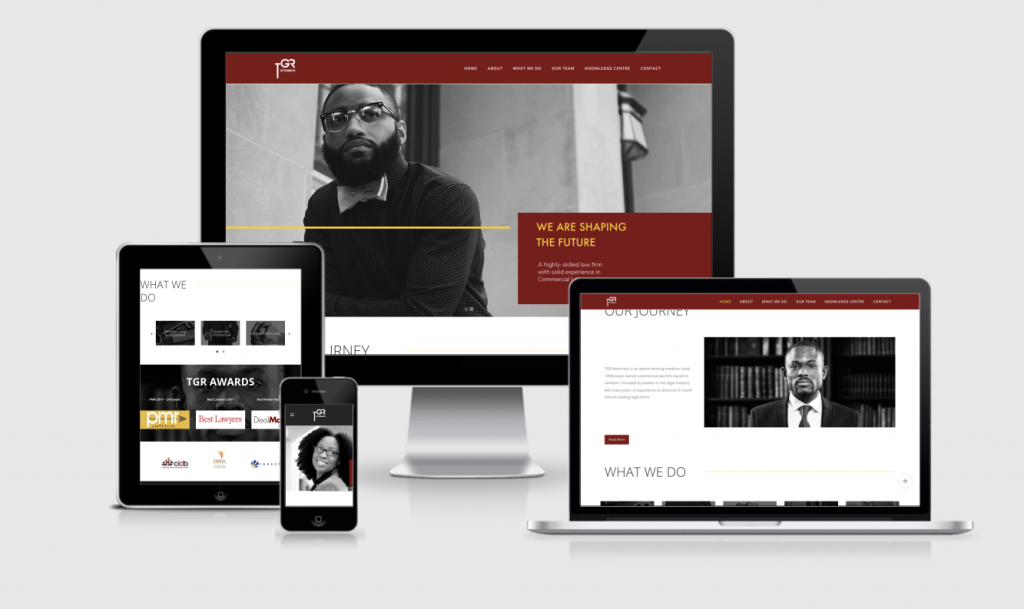
Company Name: TGR Attorneys
Maliseha Attorneys: Rationale
On the Maliseha Attorneys website, the design is sophisticated with regards to the law firm industry. Gold is the colour of extravagance, wealth, riches and is used as an accent colour. The colour gold is a warm colour that is interpreted as sombre and traditional. The colour gold is associated with illumination, love, compassion, courage, passion, magic and wisdom. The photographic elements are in high quality and vibrant colours to demonstrate the above attributes.
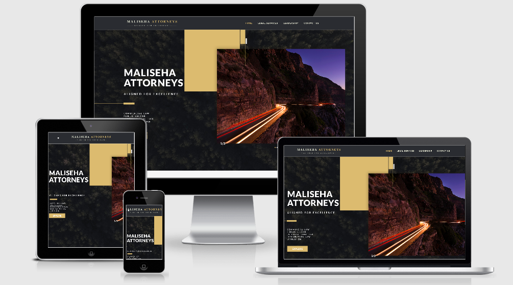
Company Name: Maliseha Attorneys
http://creativeninja.co.za/maliseha
FEM: Rationale
Again, the FEM website, as an assurance company used warm photographic elements overlapped with the Johannesburg city skyline and a cheerful construction worker to make the value proposition posed as a question relateable to the viewer. The bold use of typography and colours of photographic elements emotionally tie into what FEM are about as a company. The rest of the website is in use of the colour blue, a colour commonly associated with trustworthiness and a calm emotion. The website uses large light grey typographic titles in the white spaces to subtly grab the reader’s attention to the following information.
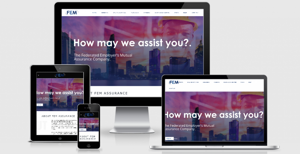
Company Name: FEM
https://creativeninja.co.za/fem/
Tourism
Thebe Tourism: Rationale
For the webpage, we focused on the simplicity of the design layout because we wanted the story to guide the tone of the page. We decided on a light, neutral, colour scheme with orange as the Thebe Tourism division colour to be the accent to complement the photographic elements of the website. The photographic elements showcase beautiful landscapes and animals to capture the mood of the Thebe Tourism vision and the message the company wants its viewers to know.
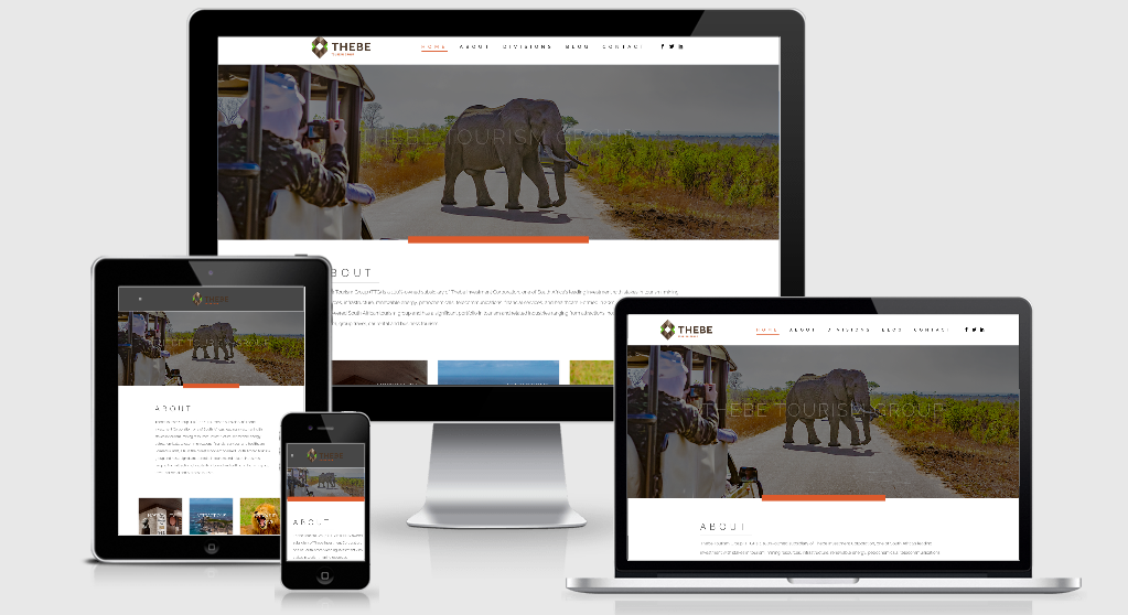
Company Name: Thebe Tourism
http://www.thebetourism.co.za/
SABC Sales
SABC Sales: Rationale
The objective of creating this microsite is to advertise the various advertising opportunities that the SABC radio shows offer. Every station will have a theme page. To further make navigation easy, we have used images with hover effects and clear text links. Everything was made large and legible to further make navigation simple. Graphs and pie charts will also be used to show ratings. The stations’ colours will also be used on the graphs and pie charts to carry the theme right through. Everything we did here was to make the site simple and very user-friendly and to ease up on having to spend too much time navigating through various pages unnecessarily.
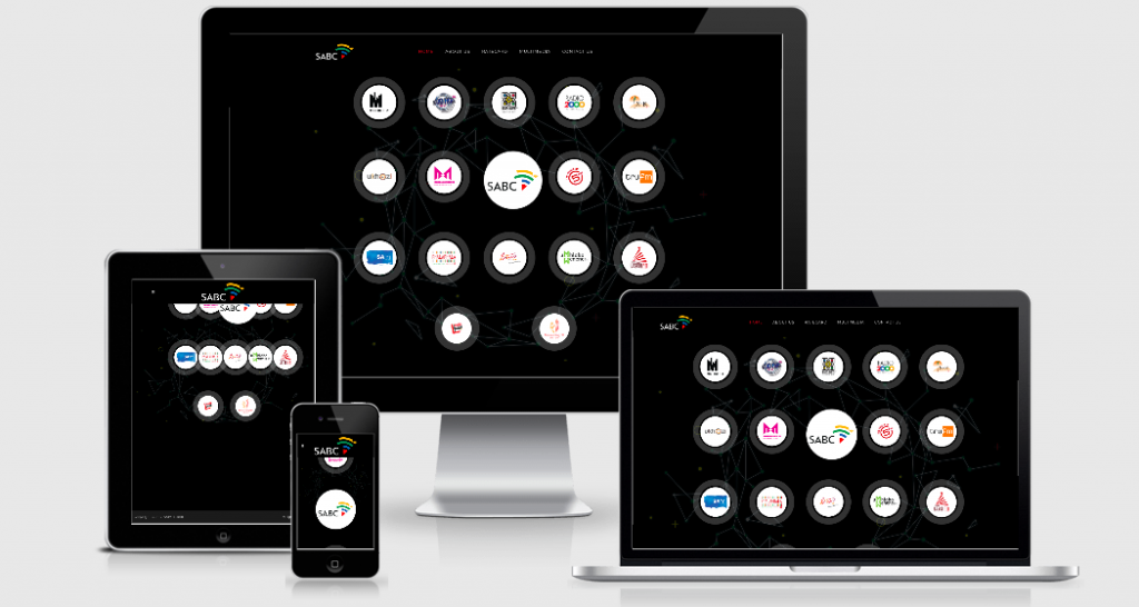
Company Name: SABC Sales
https://cubeflow.co.za/radiosabc1/
eCommerce – Fashion
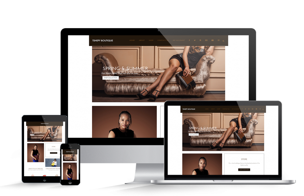
Tshepy Boutique: Rationale
The Tshepy Boutique website is intended to reflect a merge into global and local retail brands to communicate a sense of style, quality and quirky sophistication. This has been managed through a clean and minimalistic layout design complimented by rich browns and a signature pattern arrangement. These dark colour choices attribute style and quality as inherent to the Tshepy Boutique brand where the signature pattern adds a definitive quirky yet sophisticated character and feel- a quality present in many of the product choices of the boutique. As the products presented on the landing page easily sell the signature style. Not only does the website display products but it uses a call to action by the use of a button to prompt the viewer to a step further in purchasing the product.
Company Name: Tshepy Boutique
https://www.tshepyboutique.co.za/
Accounting & Auditing Firm
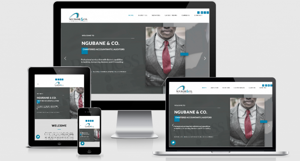
Ngubane & Co: Rationale
The Ngubane & Co website, like the TGR Attorneys and the Maliseha websites follow the design of corporate industry to allude to the serious nature of the industry by the use of dull or grey imagery throughout the website. In the website design and layout white space matters most, and the simplicity of minimal use of corporate colours, shapes and line. On the Ngubane website, we use an exciting placement of typography and shapes to bring the black and white content to life.
Company Name: Ngubane & Co
Asset Management
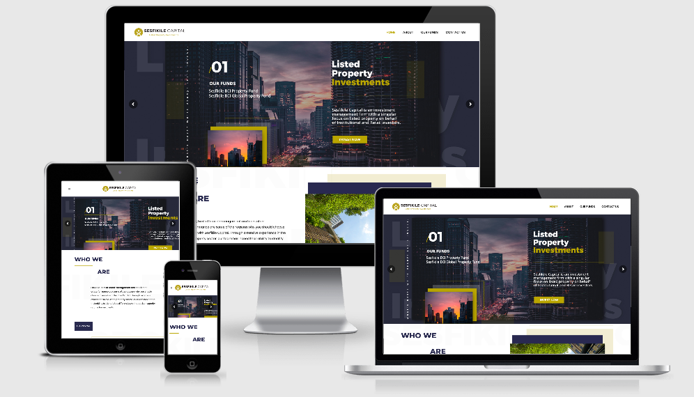
Ses’fikile Capital: Rationale
The objective of the website is to elevate and equating it to the globally listed property investment specialists it represents. The rejuvenated design demonstrates an air of Elegance, Sophistication, Modernity, and Simplicity. The golden ginger logo colour was maintained as a complement to the secondary dark blue, which conveys trust, strength, dependability & security. This, in turn, re-arms the message that Seskile is a thought leader in the realm of Global Real Estate. Throughout the website design, golden ginger was peppered in homage to the psychology of Success, Achievement, and Triumph.
Company Name: Ses’fikile Capital
https://creativeninja.co.za/sesfikilecapital/
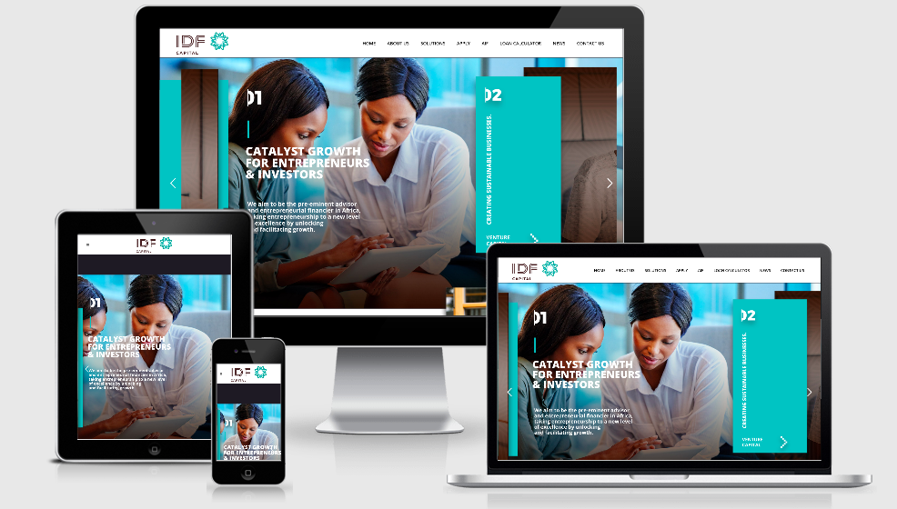
IDF Capital: Rationale
According to the IDF corporate identity guidelines, the objective of the website is to communicate channels on a dynamic platform. IDF Capital explains that any healthy portal should evolve as the usage dynamics change to suit the service offering best; with the inaugural site operates on a few basic layout principles. We incorporated a layout design that expresses storytelling, a grid formula and compatibility with a vibrant use of their corporate colours to attract the viewer attention to the landing page, as seen below.
Company Name: IDF
https://creativeninja.co.za/idf/
Balondolozi: Rationale
Balondolozi’s landing page uses their logo as part of the introduction into value propositioning who they are. As seen below, the volt used in their landing page represents safety and assurance to convince the viewer or potential customer that their investments are safe with Balondolozi.
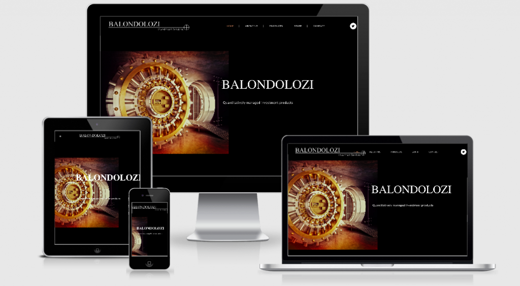
Company Name: Balondolozi
Mianzo: Rationale
The concept for the Mianzo website was based on themes of ‘self-development and enrichment’ as a metaphor for the idea of ‘investment. This has been communicated through image choices that reflect a wide range of architectural buildings. The use of gold, blue and white imagery, accented by the companies corporate ’gold colours’, are arranged simply on the home page with a few key ideas and thoughts from the provided content, call to actions have been included on each slide as a way in which to encourage the user to navigate to other pages and content to be loaded onto the site. The overall result conveys an image of Mianzo, that is timeless, modern, clean and corporate. Gold and blue imagery give a sense of history and time that solidifies the company as credible and level with companies like Allan Grey, and Prudential – from which this look and feel have been inspired by.
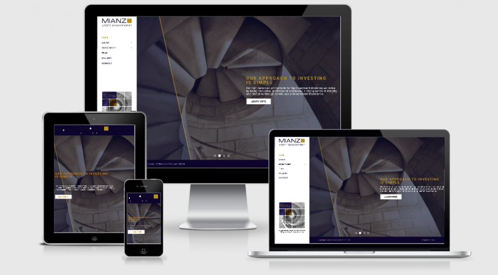
Company Name: Mianzo
Investment Holdings
Rand Merchant Investments Holdings Limiteroup: Rationale
Like the Mekan Group, the website layout encompasses a modern design that uses sophisticated and stylish photographs. The bold use of the corporate colours and the use of their company name as a value proposition that communicates the services that RMIH claims to offer. The images that are used give the viewer a visual presentation of what the company is about in the corporate investment industry setting.
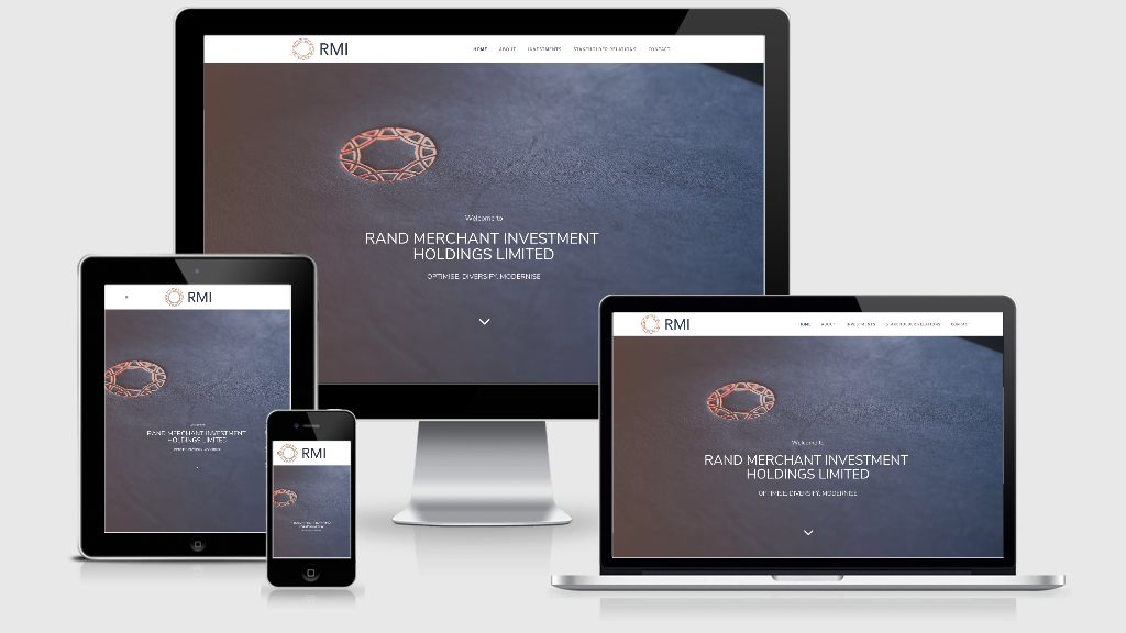
Company Name: Rand Merchant Investment
Akhona Group: Rationale
The website below shows a dynamic and multifaceted layout that embodies the earthy green colour into a geometric structure. This represents the idea of ‘mother-nature’ as the founders of the company being women and the geometric feel as the corporate industry.
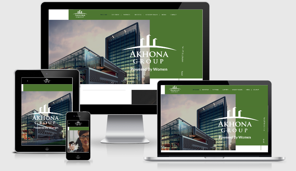
Company Name: Akhona Group
Marketing
The African Story Teller: Rationale
The website displays an African look and feel of the company’s corporate identity with the warm colours to match the ethos of the brand. The fashion-forward models indicate that the company is cutting edge and put their best foot in the forefront.
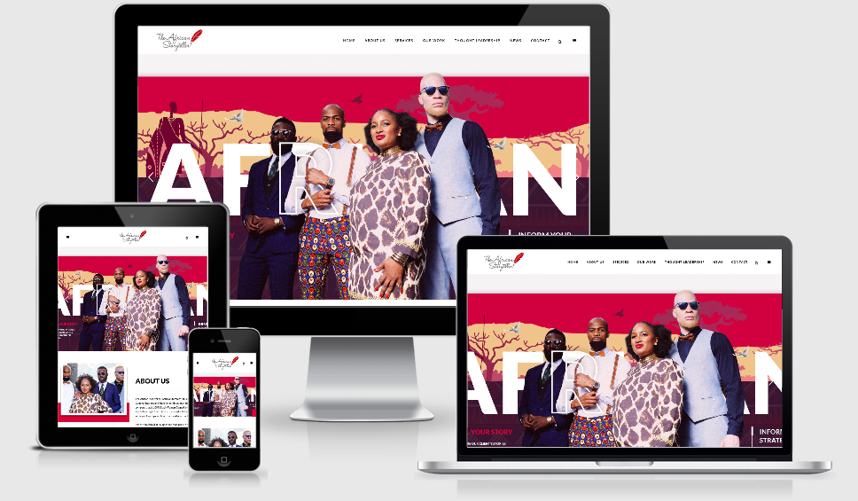
Company Name: The African Story Teller
https://creativeninja.co.za.TheAfricanstoryTeller/
Events
AABLA: Rationale
For this website we chose a very elegant and clean layout. We also chose a font that’s timeless and easy to read. Our reason for these choices was to make it easy for the user to navigate through this one-pager website.
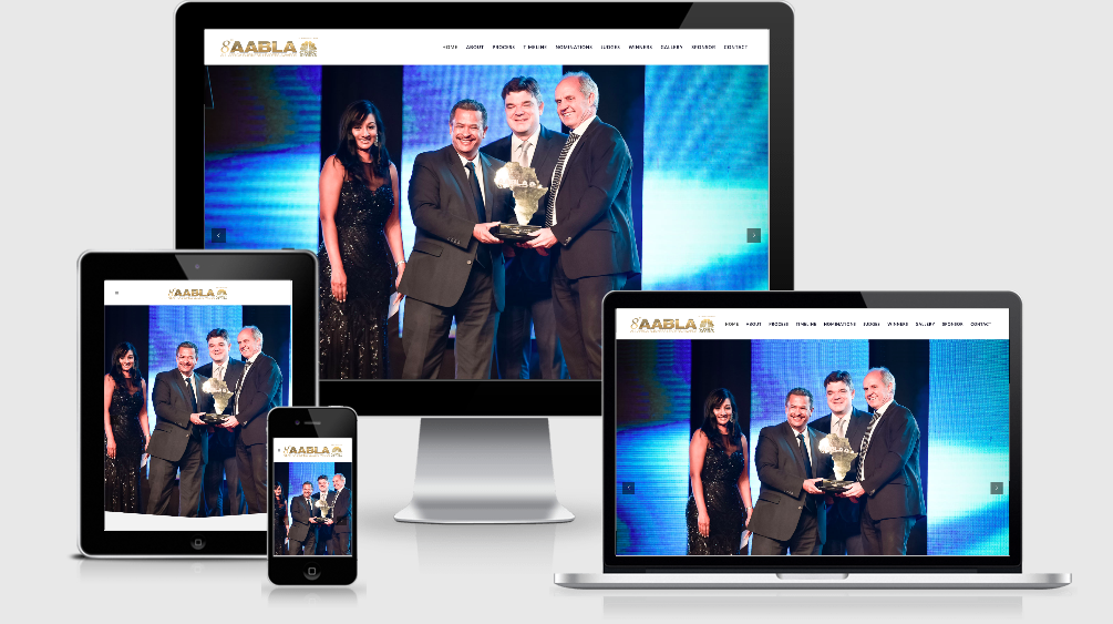
Company Name: AABLA
GEPF: Rationale
As a world-class pension fund, GEPF’s inaugural event site draws on the use of blue and gold to pay homage to the credibility and magnitude of the work done by the organisation. Green speaks to warmth, communication, compassion and care; a reflection of the manner in which GEPF clients should relate to the brand.
The website layout used on the website is simple, striking, strong and modern. The whole idea of the website is to keep people updated about the upcoming conference, and also keep them on the loop as to when it’s going to happen; hence the countdown timer. A bold font has been used to emphasise each section that the user is reading on the site. The colours that are used in the site are strong, simple and reflect a certain image/standard that the conference is to portray. On the home page, we went with the symbolism of the economy which is reflected as the touch points on the African Continent. The secondary image is a vintage watch which represents the long term investments of a pension fund. Tertiary images would be the conference seats.
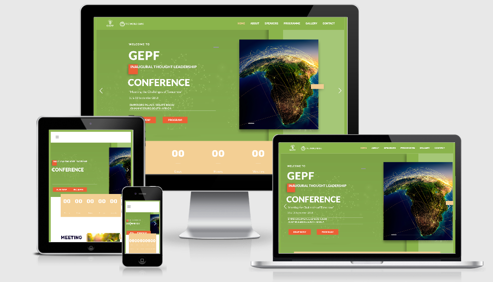
Company Name: GEPF
http://www.gepfconference.co.za/
Health Care
Sachin Bawa: Rationale
The design of the website is geared towards a simple, clear and professional look showcasing exactly what services Dr Sachin Bawa provides. The layout of the site is clean and gets the viewer’s attention towards the important elements of the company. The Imagery used on the home page reveals what Dr Sachin does before you read through, sending the right message. The images have been used where necessary to display a visual view of the content. Every section of the site has been designed in a user-friendly manner making it easy for the visitor to navigate easily throughout the site and find necessary information they will require. The 1st slider introduces the user to what the company does, with a subliminal image on the background to support that. The next slider goes into detail as to what you might need and how they can assit. The final slider slightly pushes the user towards hitting that call to action button and contacting the company.
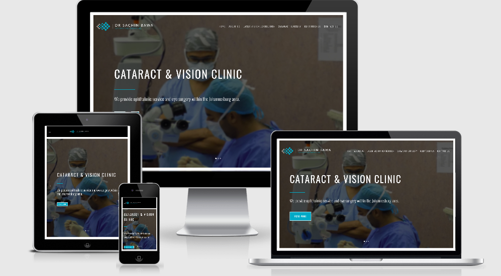
Company Name: Sachin Bawa
Pharmaceuticals
Allergex: Rationale
The idea behind the website’s visual designs showcases representation of the allergens that people may suffer from, such as dust and dander from fur or pollen from different kinds of plants and foliage. The design of the artworks fosters the message in the copy by presenting the audience with a series of allergy causes that they have to struggle with every day, whilst simultaneously giving the solution to whichever allergen they may be afflicted with. Thus emphasizing the message of ‘Free To Be You’.The brand is assuring people that ” these may be the things you suffer from, but here is your solution.
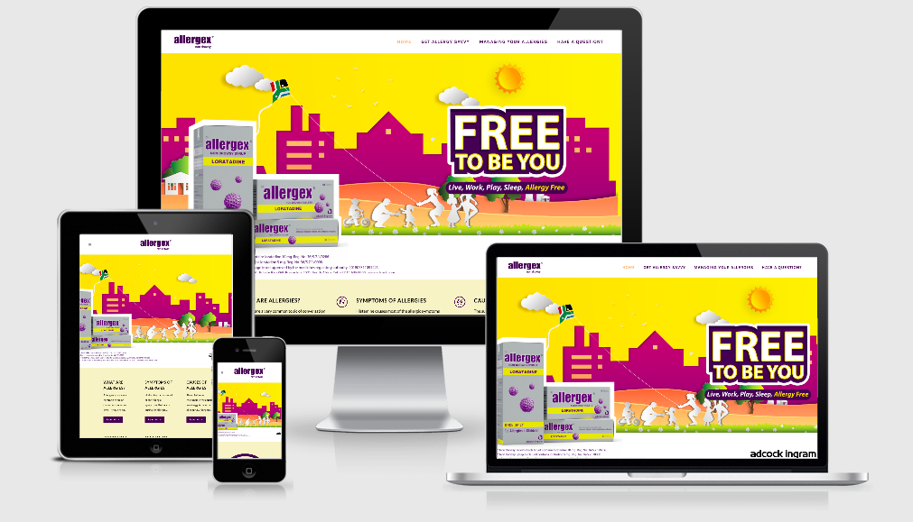
Company Name: Adcock (Allergex)
http://www.liveallergyfree.co.za/
Farming
Afrikan Farms: Rationale
Afrikan Farms is a family owned African commercial farming enterprise, which, encompass Livestock farming and crop farming. Afrikan Farms’ website which best shows who they are to their clients and what they do. The design of the website is clean, professional and informative; giving enough information for the user to know exactly what it is Afrikan Farms does. The landing page displays images based on the actual people, buildings and animals found on the property. The colours used are black, brown and gold, which all compliment each other on the website. These colours were used to keep in line with the colours of the corporate identity.
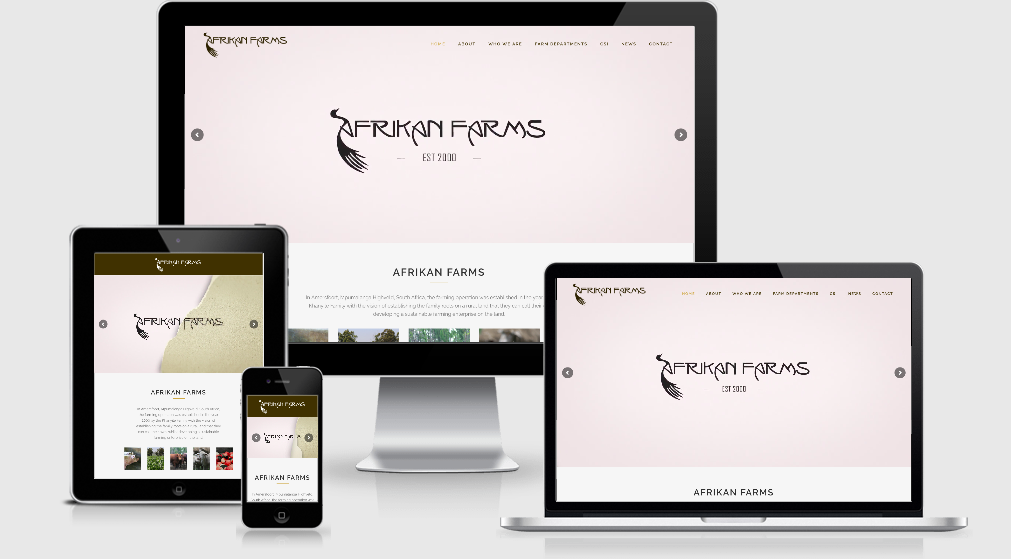
Company Name: Afrikan-Farms
