25 Dec 8 Things To Consider putting On Your Homepage
Homepage Your homepage is your storefront. In a few seconds, a site visitor will make a decision whether your website is worth exploring or not. In a brick-and-mortar business, no one will even dare come in if they do not know what your store is selling, unless if you are a popular brand like Nike. So what things should be there on your homepage to make customers engage? It Should Tell People What You Do You can use a picture or you can use a sales copy. Whatever it is, your landing page must be bold and direct.
Your Value Proposition
It should tell people who you are and what they can expect from your website. If you are a cooking expert, then you have to use daring pictures of food, or words like “recipes.” This tells people right away what your business is and if it is of interest to them. It Should Tell People Who You Service Not all online businesses serve the whole world. At the very least, your homepage must immediately give a hint about your target market. This is why many landing pages start out with questions like “Need to Grow Your Business?” instead of “Get 10% off!” It tells people that they landed on a site for people who need to help them achieve their business goals. If you only service South Africa, then this must be included in your banner.
Solution You Are Providing
 It Should Tell People What Problems You Solve The only reason people will come to your website is if they have a problem. If your homepage does not clearly explain the problems you can solve, your visitor is not likely to engage. An example of a problem is poor sales. Your landing page must indicate that you can solve this problem. And again, if you are servicing South Africa, the proposition must include this.
Call To Action
 It Should Have a Bait and a Hook The bait is the solution you offer. The hook is your call to action. Once you have presented what you do and what problems you can solve, your front page must include an offer as a free trial. The hook is a word that tells the customer to do it now because if he doesn’t, he will miss a precious opportunity to solve his problem.
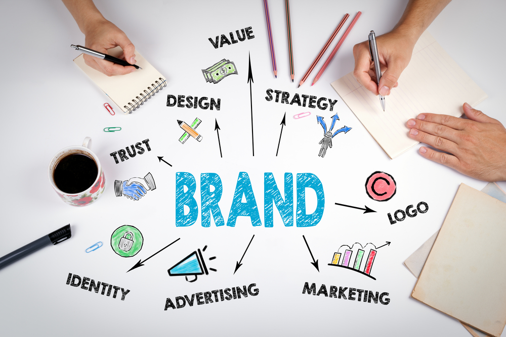
Your brand and Slogan
 It Should Have Your Brand and Slogan Your brand is who you are. Your logo is what gets imprinted in your customer’s mind. Without a well-designed logo, your front page will not deliver a strong message. It is nothing more than a sales copy. Your slogan must appeal to the person’s emotions. It must be strong. If you think of Nike, it says “Just do it.” It encourages people to have courage. You must have a slogan that imbues your logo with a strong message.
Resource or Product offering
It Should Have Link to Resources The resources page can be a blog, a video, or a tutorial. It does not matter. Your customer went to your landing page and this is the best opportunity to redirect them to pages that will help them understand what value you can provide. Do not expect visitors to make a purchase right away. What you need to do is direct them to pages that will convince them of your claims.
Clear Terms and Conditions
It Should Have a Footer This is different from the resources page. The resources page are focused on the value you provide. The footer page is dedicated to legal requirements and your policies. This can also contain a link to your “About Us” section and a link to the “Contact Us” area. All your terms and conditions must also be placed here so the visitor has visibility about everything. Transparency is one thing you should not deny a consumer.
Easy Navigation On Website
It Should Have a Menu A menu is a navigation tool that easily allows your customers to explore your website. Many landing pages do this by creating a header menu or a sidebar menu. This navigation tool must be concise. Organize it in such a way that each selection tells the consumer where he will be taken if he clicks on it. A link to Shipping Rates tells the consumer that if he clicks this, he will be taken to a page about shipping costs. A menu that says Products tells the consumer that he will be able to see what you offer if clicks it.
Summary There was a time when web pages were designed with too much clutter. Today, the global trend is to keep your homepage sweet and simple. It has to lean towards minimalism, which is the perfect embodiment of “less is more”. BWD Advertising is at the forefront of this. We are a marketing agency and we have great ideas to share with you. We can help you make your website deliver more results, increase engagement, and make a lasting impression to your visitors. Your homepage is a locked door to get sales and engagement. We have the key to open it.


