18 Jun Design Trends For 2014
What’s trending in the /top deck hair dye jobbed, skater shoe’d, and stone washed/ trenches of the East Rand would provoke the sensationally styled Sandtonites to lynch mob extremes.
“No one wants to be that lady with the perm, the guy with the crocs or the tool walking around with his jeans slipping off silk shorts of decades past.”
Just like Fashion, graphic design is an ever evolving machine where today’s trends are tomorrow’s tragedies. Thus, a corporate identity should essentially be like Naomi Campbell (minus the phone tossing) – a manikin that dons and discards the season’s latest and greatest. The most timeless brands are the ones that can adapt to the times, without losing identity.
As trend conscious design mavens; Breeze Website Design’s explosive team of creatives pride themselves on being able to produce weatherproof Corporate Identities and designs that are both on trend and fashion forward; locally and internationally.
Thus, herewith a look at what’s turning heads, stomping the ramps and gracing all the covers in 2012’s worldwide design scene: Birkins full of badges and banners If it looks like a boys scout badge, uncle Sam’s “I want you” button or a blue horse ribbon like banner; it’s all the rage right now. Easily translated into icons, rustic and with endless branding spin offs; incorporating one of these elements will dazzle clients with its versatility.
Geometry in Gucci
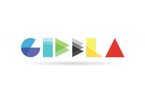
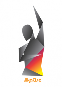
Simplicity is best friends with geometry. Despite delivering a simplistic end product – geometrical design is definitively not child’s play. Arranging, colouring and adding depth and gradient can be a challenge for the most seasoned designer. Yet, when the look is accomplished; it’s easy to see why geometric design is so en mode.
Membranes, by Mark Jacobs When taking a microscopically close look at this year’s styles; the Membrane aesthetic is one of the most striking contenders. This bio cellular and optically engaging look is as fresh as it gets. Using pointillistic type cells with powerful bursts of colour can be utilized to create a very imposing finish.
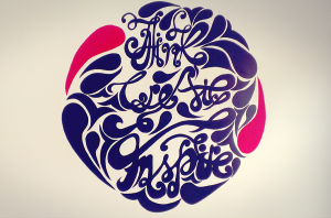
Hermes for hand drawn Departing from the plastic hyper glossy and reflective designs that’s become a dime a dozen, hand drawn design is popping up all over. Lending a little authenticity and a personal touch through hand drawn features makes for a roughhewn beauty and unsymmetrical perfection.
Ralph Lauren goes retro Pink Floyd, vinyl record cover, Never Ending Story poster dusty, design back in the day retro anachronistic nostalgia. Before automatic typesetting, Photoshop streamlined, nip and tuck perfection; there was old school design that’s just dying to be reinvented. Perhaps (with all the advances of design) we can venture to do retro better than they did way back when.
Having an introspective look at your company’s CI, ask yourself: Is your CI catwalk or charity shop chic? If you suspect, you’re the man with the mullet; perhaps it’s time that you let Breeze Website Design bring your brand back into the now.
