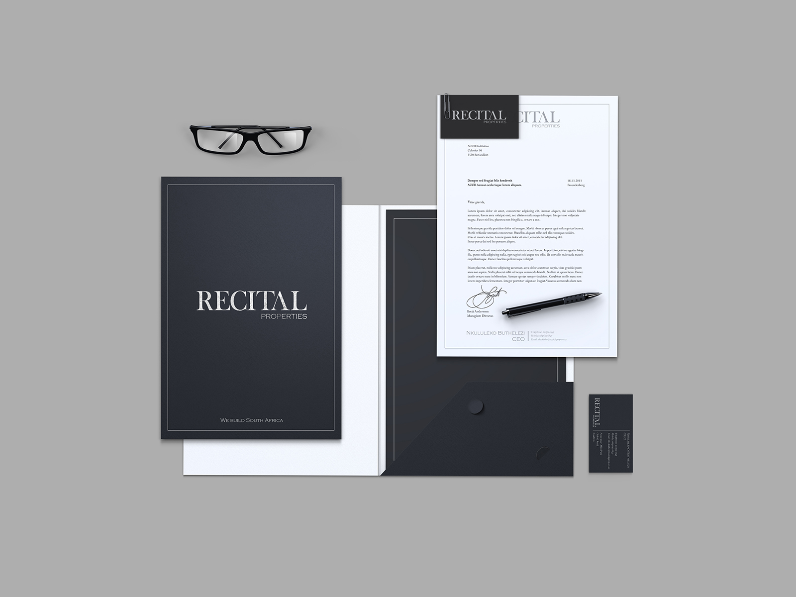
Corporate Identity
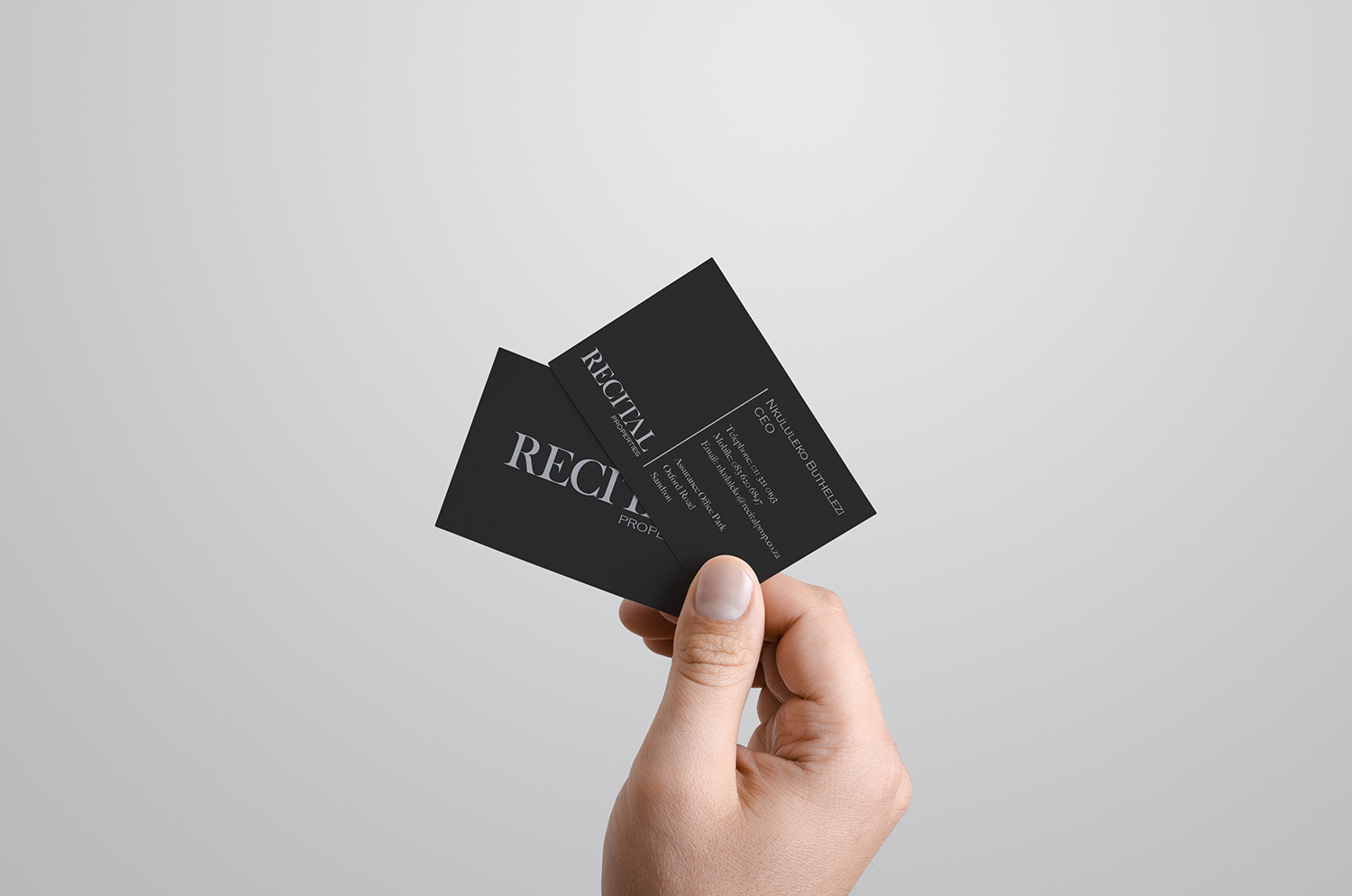
Business Cards
Vehicle Wrap

Boardroom

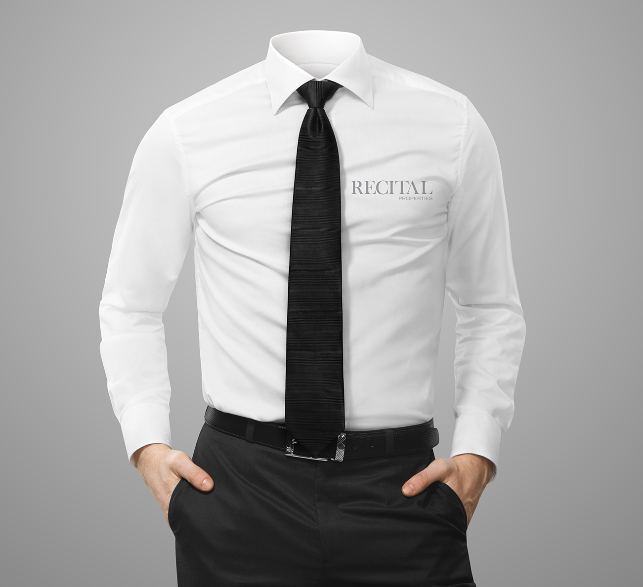
Clothing
Rationale
Excellence, professionalism and quality – three words that Recital Corporation strives for.
The initial design concept for the logos was designed as a more traditionally corporate interpretation, which was inspired by other well known corporate companies. It was decided to construct this logo out of typography only because it can be easily distributed over the various subdivisions where as an icon limited this option. A custom font was created for the logo as to give it a certain edge that was needed as well as set the company apart from other identities.
The font used ensures the communication of excellence, professionalism, trust and quality.
